Love Lincolnshire Wolds
A vibrant brand evolution
Reflecting nature’s
beauty through a
new visual identity.
After multiple successful collaborations, Destination Lincolnshire and the East & West Lindsey District Councils approached us with an exciting new goal: to deliver a new identity for the Love Lincolnshire Wolds brand.
Ruddocks was appointed to better define and support the organisations’ common goals, centred on promoting tourism in The Wolds area and attracting new visitors.
The Lincolnshire Wolds is a place full of heritage and authenticity, featuring ancient landscapes, unspoilt natural beauty and timeless rural charm, and we were excited to help develop this unique destination’s strategic positioning.
Developing a vibrant
and timeless brand.
The Lincolnshire Wolds landscapes change with the seasons and differ from one day to the next. Wildlife migrates, farmland flourishes, while local communities welcome visitors to soak in the simple pleasures of country life.
Our vision for the Love Lincolnshire Wolds brand celebrates this wild, natural backdrop and everything that defines it.
Inspired by the Wolds landscapes, we began expanding the logo’s usability, creating a whole vibrant brand suitable for any communication channel.
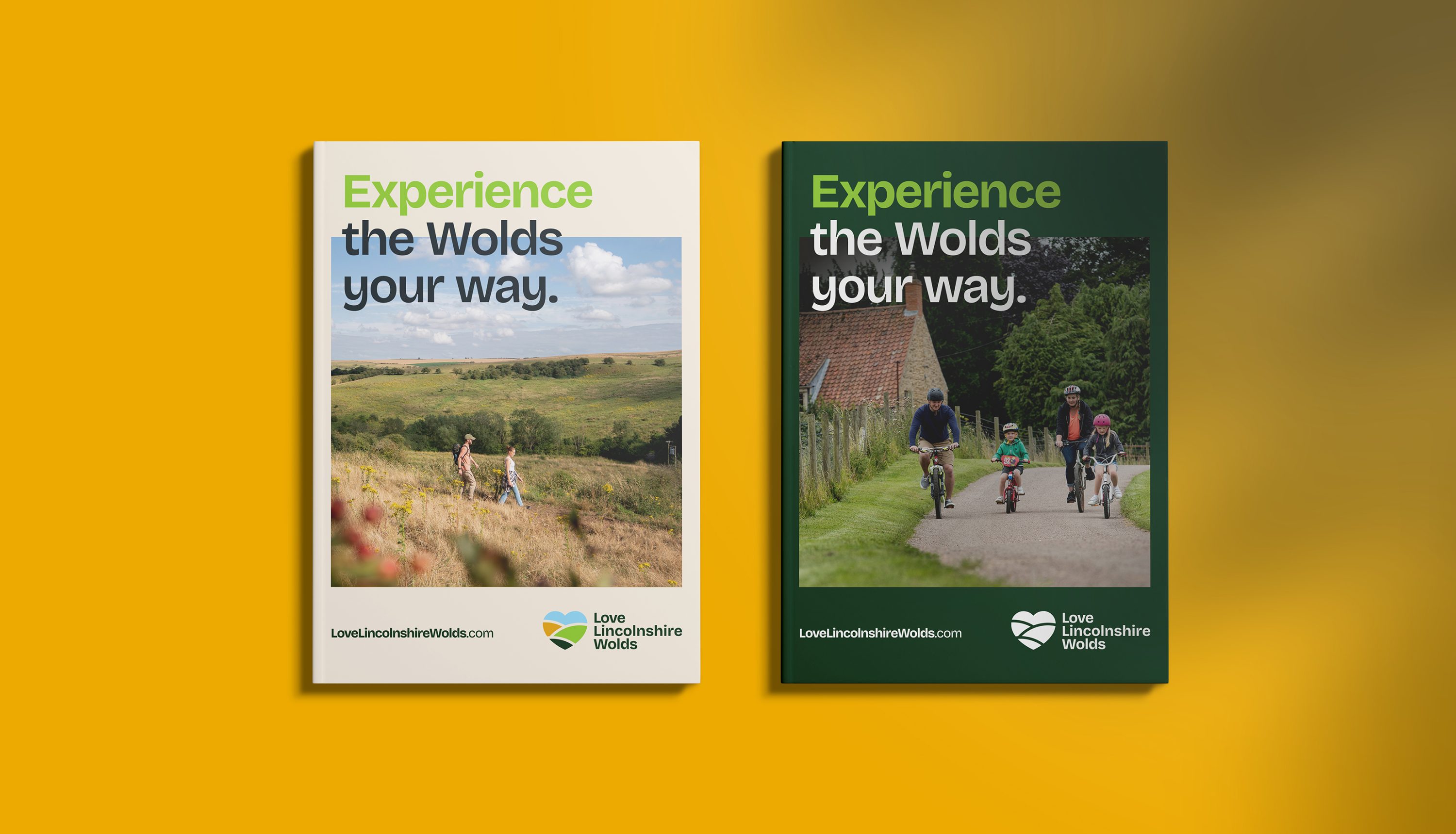
Reflected through a refined and contemporary colour palette, we made the new brand come alive in bolder ways. Taking inspiration from the beautiful hills and open fields, we chose dark green and pale cream tones, as well as shades of gold, blue and brown.
Transporting tourists
into the heart of the
Lincolnshire Wolds.
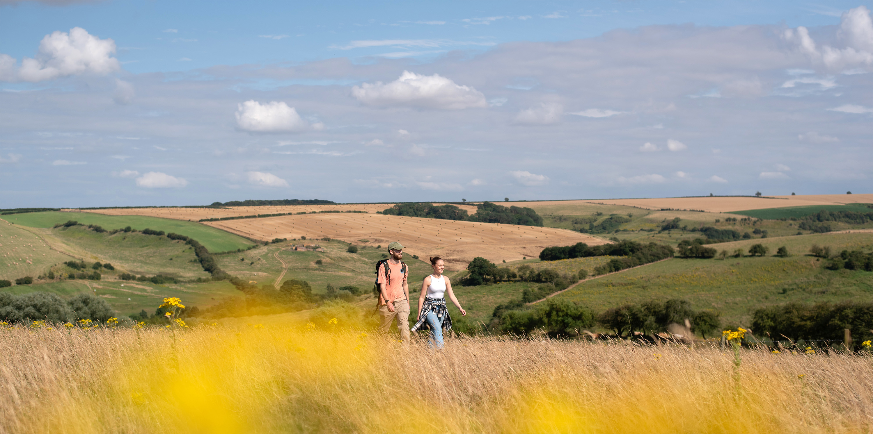
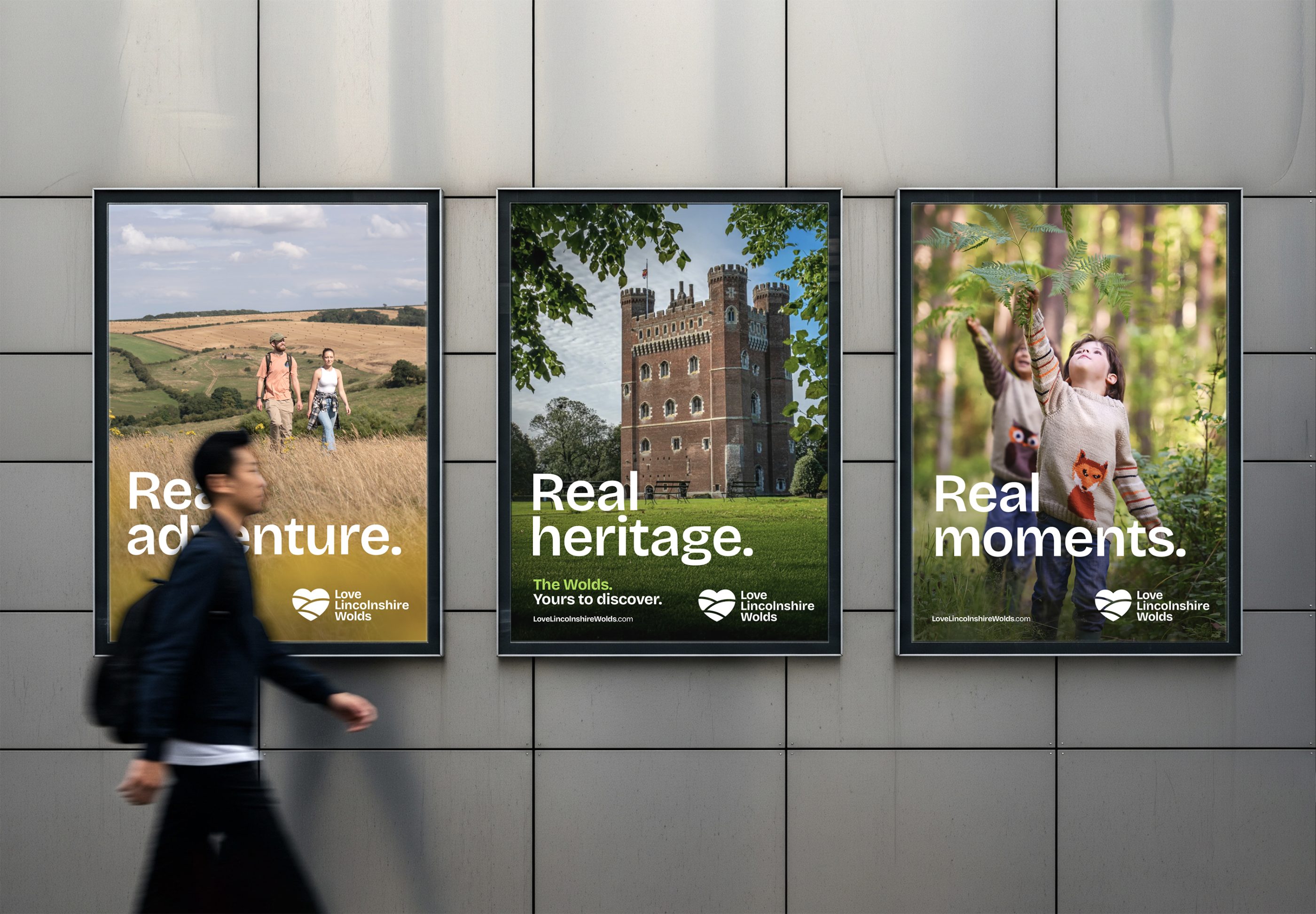
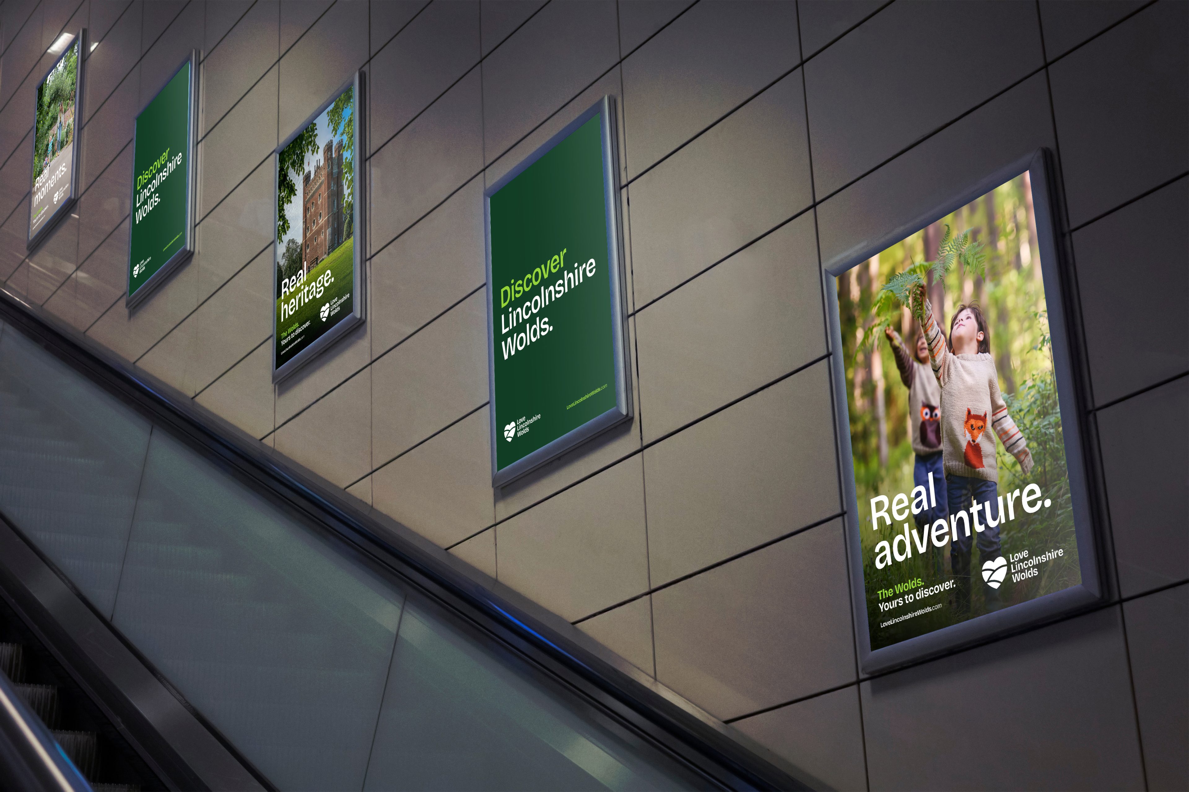
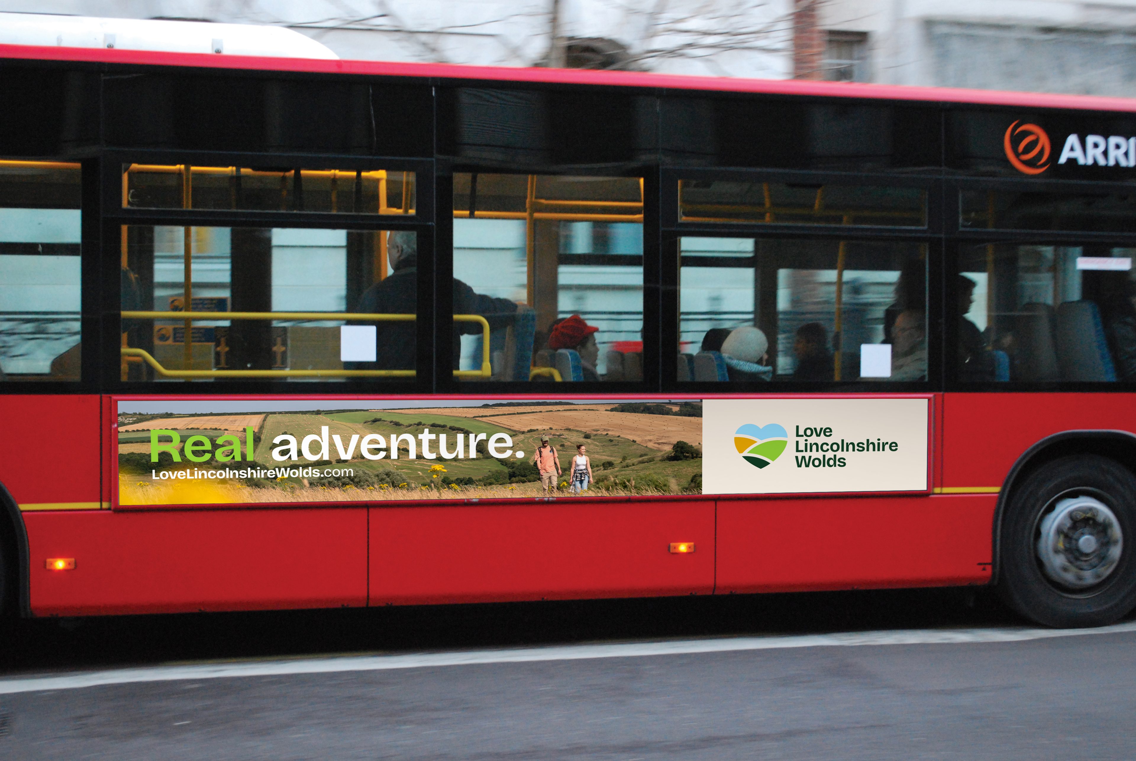
The photography we selected to accompany the new brand assets depicts lush greenery, explorers on scenic walks, and charming market towns with cosy villages.
In addition, we aimed to showcase ‘Real Moments’ so that those featured in photographs illustrate the broad spectrum of people who live in and visit The Wolds.
The goal of this evolved visual identity was to put the audience at the centre of the experience, helping transport potential visitors into the heart of the countryside trails and peaceful destinations.
Never stop exploring:
An authentic verbal
identity inspiring visitors.
The tone of voice for the topline messaging we developed was aspirational, authentic and approachable. Using the word ‘real’ as a prefix, we put emphasis on the authentic experiences visitors should expect.
Phrases like ‘Experience the Wolds your way’ encourage tourists to feel at home and create unique moments while discovering hidden corners and quiet surprises.
The verbal identity characteristics we proposed in the new brand guidelines were confident and witty. Then, we picked Bricolage Grotesque as the primary font for all headlines, and Inter as the secondary typeface, to balance character and uniqueness with legibility.
Our team also ensured all assets are accessible, opting for WCAG colour contrast, according to AA compliance standards. This helps the imagery and text be easily perceived, accurately reflecting the positive adventures waiting to be experienced by all.
As a result, the Love Lincolnshire Wolds brand evolution became an essential tool for promoting tourism in the region, ensuring it’s here for everyone to enjoy.
Identity application:
Embarking on a
unique journey.
To highlight the distinct charm of each market town in The Wolds, we designed additional sub-logos for different locations, making the Love Lincolnshire Wolds brand more versatile, while keeping a consistent style.
The Wolds offers something for every pace and passion, and we kept that in mind throughout the creative process.
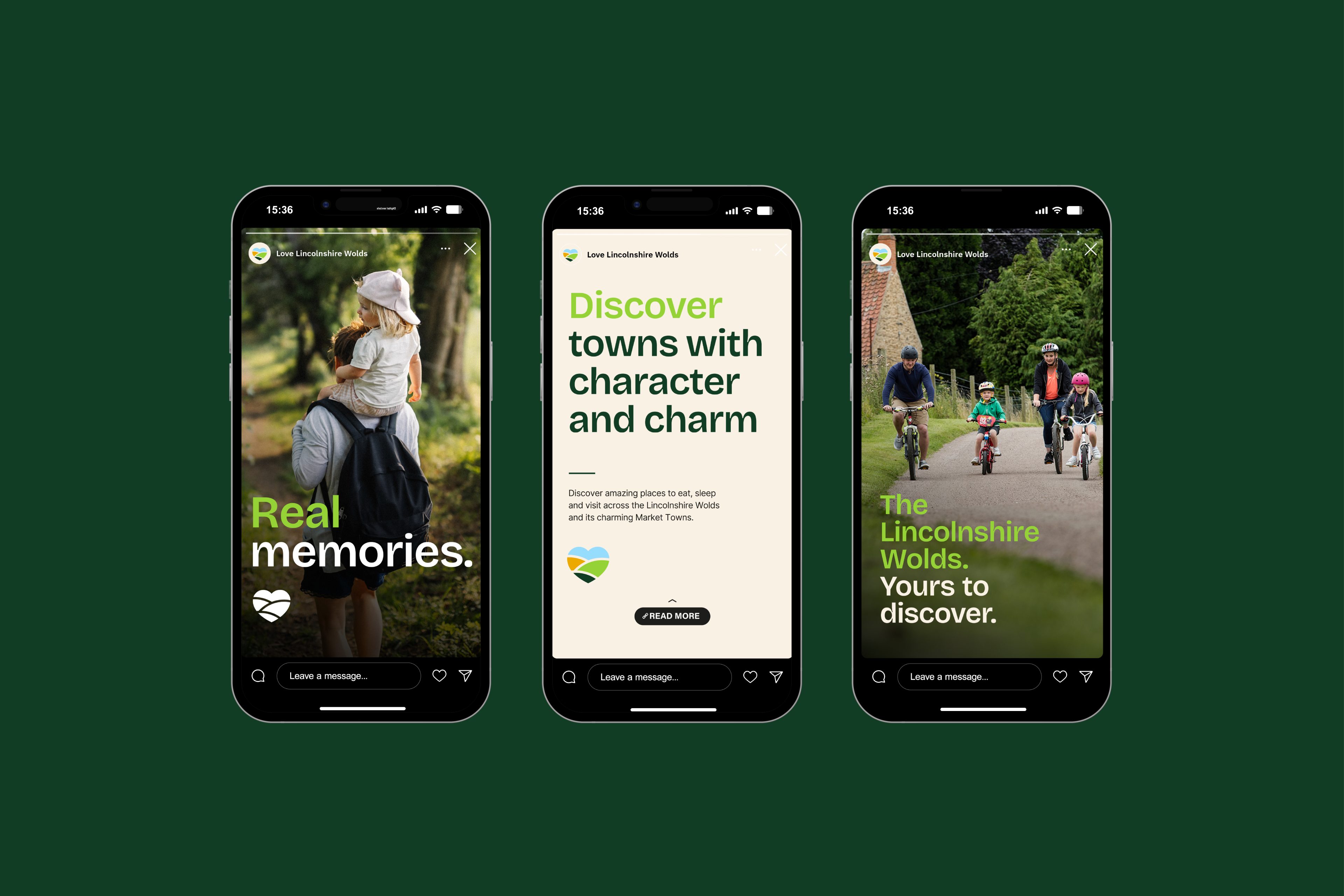
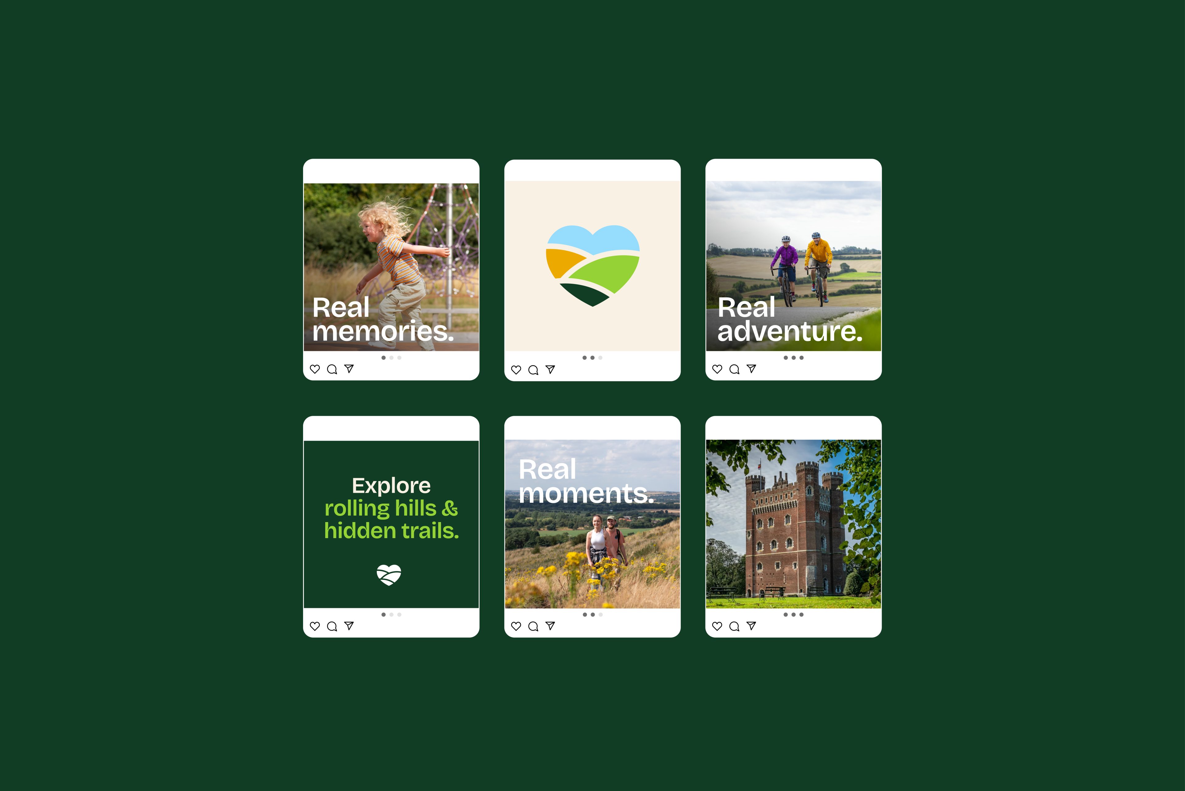
So, while designing social media assets, we placed leisurely countryside walks in contrast with more adventurous outdoor sports. Showcasing all these possibilities helps the Love Lincolnshire Wolds appeal to a wide range of visitors.
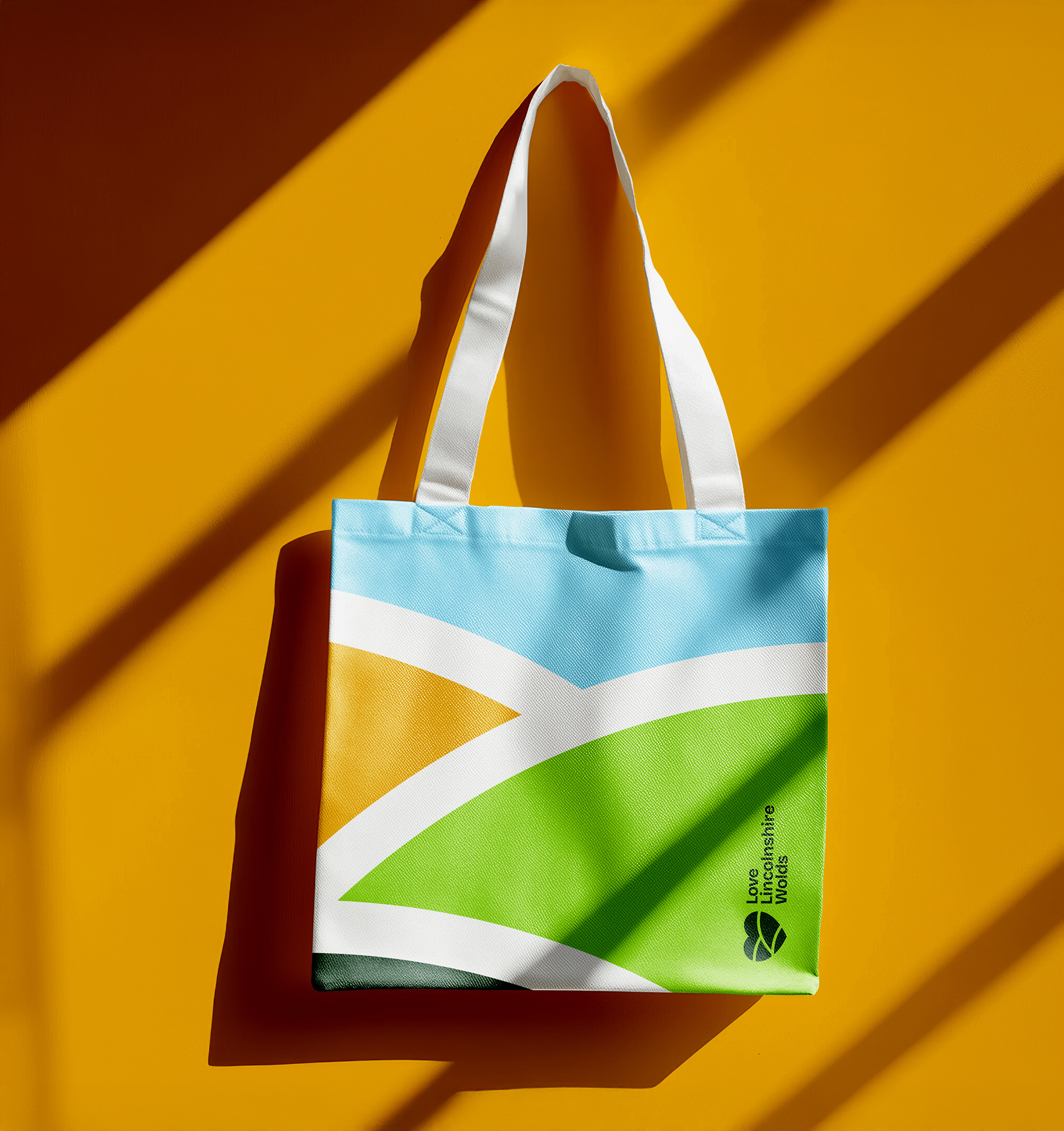
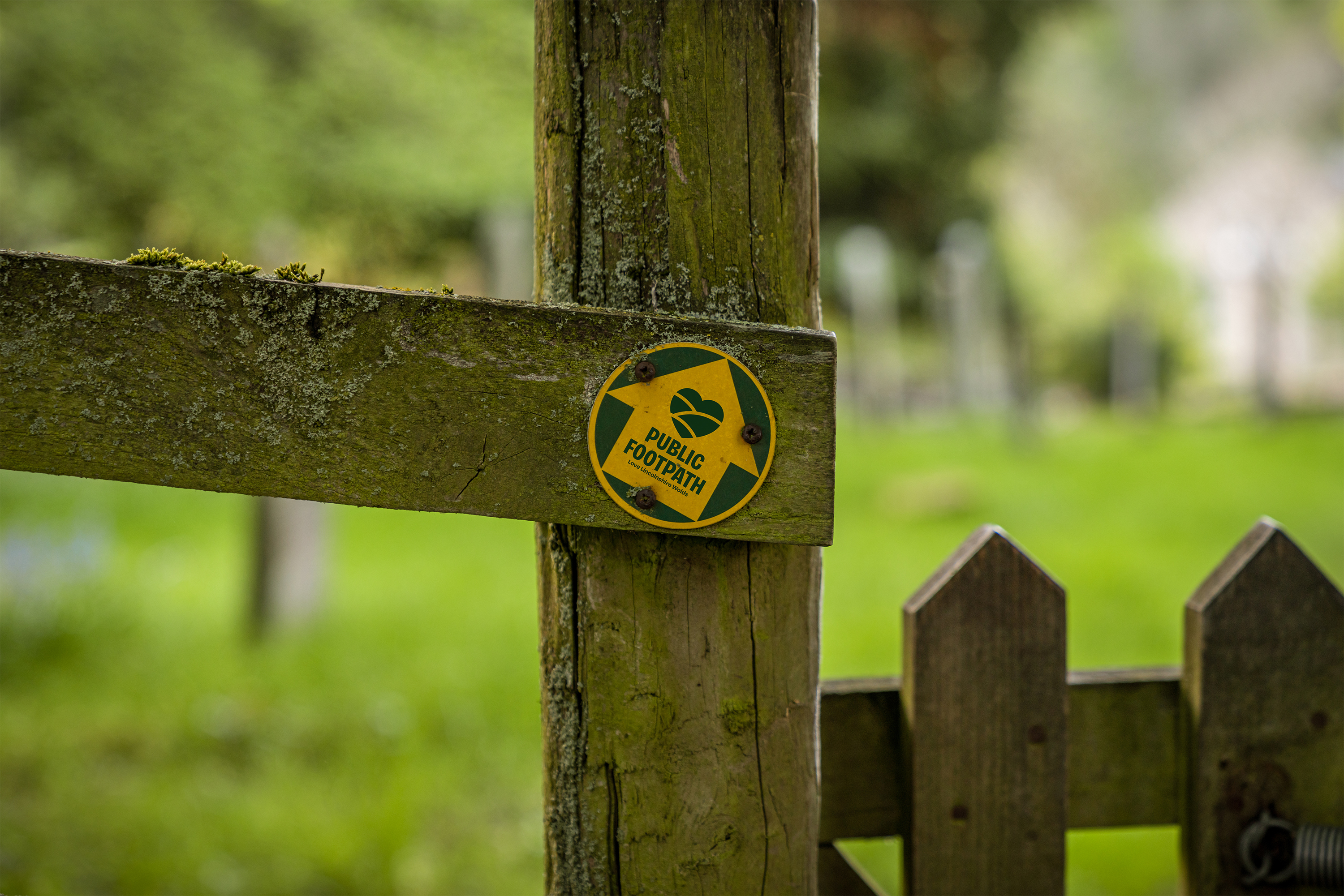
Lastly, applying the brand theme across a wide variety of channels, our team created visual concepts for social media content as well as printed brochures, way markers and supporting signage, merchandise, business window stickers, and physical ads, like posters in tube stations and on public transport vehicles.