
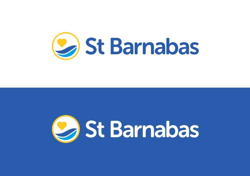
We’ve been working with end-of-life-care charity St Barnabas for well over a decade, and seven years ago we were commissioned to realign their brand to better represent their offering and positioning as a leading local charity. While discussing the aims of the project, it was clear the brand should be future-proofed, to be able to grow and change alongside the charity. Having recently identified the need to simplify its messaging and create a more personal look and feel, we took the brand to the next stage in its evolution.
A fresh new look
We have updated the logo, stripping it back to a more minimal representation whilst retaining its familiarity, alongside this a more personable and friendly secondary handwritten font has been introduced in order to highlight some of their messaging; St Barnabas is an organisation driven by helping people, and they wanted that to be shown through the new styling. They also recognized a real need, from a marketing and communications point of view to be able to separate their support and fundraising activities from the clinical side of the organisation, something the simplified brand will give them the flexibility to do more easily. The rebrand is currently being rolled out across their communications and marketing collateral and we look forward to seeing it in action.
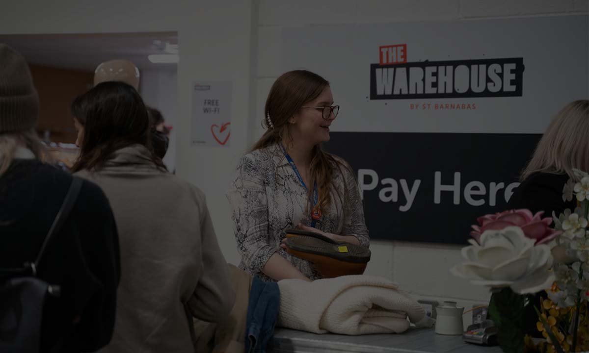
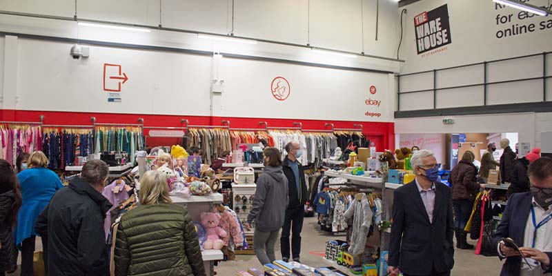
A new approach to retail fundraising
Their main brand isn’t the only project we’ve been involved in for St Barnabas recently; we have also been working on two other strategically significant brand and design projects. The first is the brand for their new Warehouse initiative – a conversion to turn their old donation sorting space into a new flagship store, with an ‘industrial style’ look and feel which was opened at the start of February. Having created the brand to reflect their vision of this brand-new fundraising space, we then developed supporting creative assets, including external signage, vehicle liveries, wall graphics and point of sale materials and new price tags to compliment the raw textures and bare-bones aesthetic of the Warehouse. We think it looks great, and we encourage any of our clients and friends in and around Lincoln to visit the new shop on Cardinal Close, as well as donate if you can.
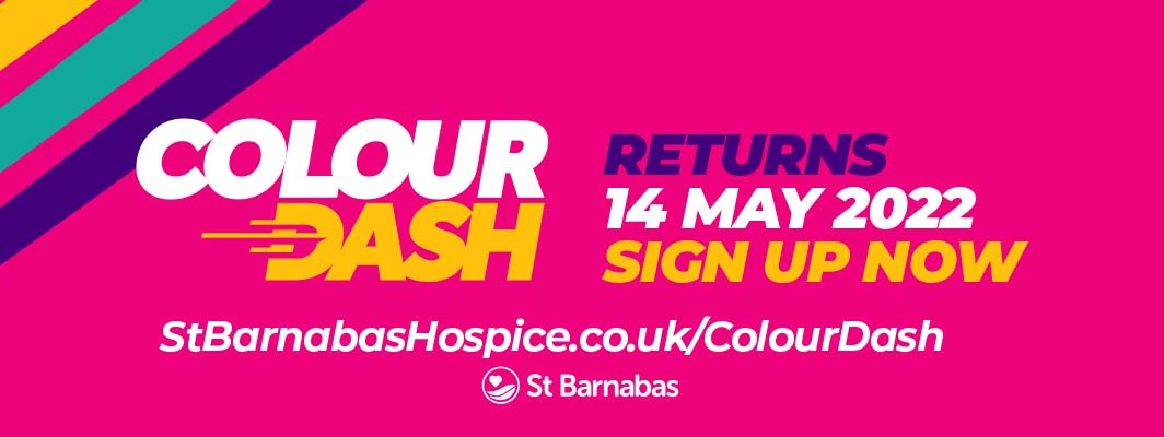
The relaunch of a colourful event
Secondly, we were commissioned to refresh the identity for this year’s Colour Dash; St Barnabas’ colour run fundraising event. Having been postponed for the last two years, it’s back this year, ‘bigger and better than ever before' and this year honouring the charity’s 40th birthday celebrations. We helped them re-launch the event with a fresh, new, simplified brand and marketing style, focusing on energy, fun, vibrancy and a family-friendly feel.
If you are interested in getting involved or supporting the Colour Dash event, please visit this link to find out more.
Whilst some caution remains, it’s an exciting time for charities as they reopen fundraising initiatives and events, after a very challenging couple of years and we look forward to continuing our work with St Barnabas now and in the future, and hope that their new initiatives are just successful as they deserve to be.